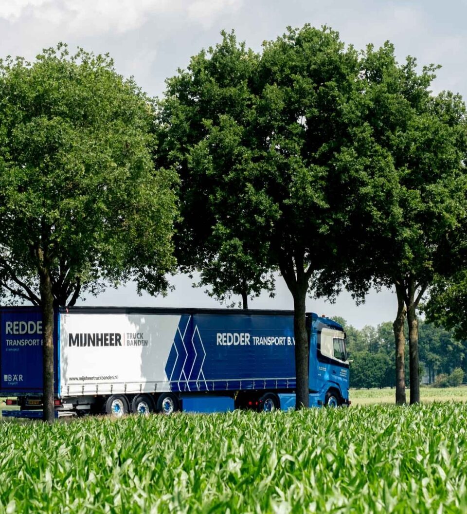
Mijnheer Truckbanden.
Mijnheer Truckbanden supplies truck tyres to hauliers in the Netherlands, Germany and the UK. We built their B2B-only store back in 2020; almost seven years on, we moved it from the Luma theme to Hyvä, keeping the design exactly as it was and taking the homepage from 38 MB down to 0.36 MB.
The short version

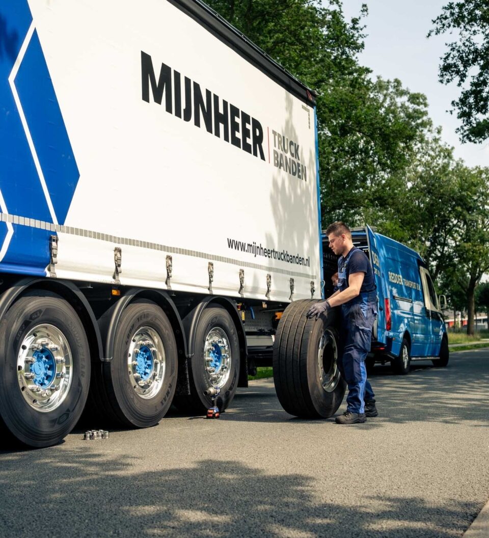
Mijnheer Truckbanden is an international wholesaler of truck tyres: a family business with forty years behind it, serving hauliers, fleet owners and workshops in three countries.
The store as it stands today is one we built in 2020, on Magento with the standard Luma theme. Almost seven years on it still does its job, but the foundation had been overtaken: Luma is heavy, every change cost more time than it should, and on a phone with a weak signal it was no fun at all. It was well overdue for a Hyvä upgrade.
This is a B2B-only store. Prices are agreed per customer and come from the ERP, visitors who are not logged in see no prices and cannot order, and new accounts are approved first. The store only becomes a store once you are a customer. That gives the frontend a different job than it has in a consumer shop.
The brief was not to make it look different, but to make it faster and easier to maintain. So: new foundation, same design.
A store that is mostly a tool
Mijnheer's customers do not order from the sofa. They order from the workshop, from the cab, between two runs. Usually on a phone, often on a weak signal, and almost always in a hurry: a truck standing still on a blown tyre costs money.
For a store like that, the frontend has a different job than in a consumer shop. Nobody needs to be seduced. Something needs to work. Which means: little to download, little that can stall, and a page that is there before anyone gets impatient.
The choice: same design, new foundation
We deliberately did not redesign. Two big changes at once, a new frontend and a new design, makes it impossible to tell where a problem comes from. And it forces the client's own people to relearn their store, which nobody had asked for.
The existing, live store was therefore the standard. Not "close enough", but demonstrably the same. To be able to stand behind that, we measured instead of eyeballed: page by page we put the new build next to the old one and compared colours, sizes, margins and column widths. 184 measurements per storefront, plus checks across all three languages, on the pages you only see once logged in, and on the translations.
That sounds excessive until you try it. Comparing screenshots by eye misses exactly the things a customer spots immediately: a footer running the full width, a dropdown menu that is simply gone, a twenty-pixel flag that has become eighteen.
What Hyvä does differently from Luma
Luma, Magento's default theme, builds its pages with three layers of JavaScript stacked on top of each other. It works, but every change means working through those layers, and the visitor downloads all of them. Hyvä turns that around: the page arrives ready-made from the server and a few kilobytes of JavaScript are added only where something genuinely has to click or slide.
For this store, that worked out as follows. The homepage went from 38 MB to 0.36 MB and from 238 to 29 requests. The category page from 1 MB to 0.34 MB. The time the browser spends blocked on JavaScript went from 21-28 milliseconds to zero. The Lighthouse score on mobile went from 74 to 98 on the homepage and from 79 to 91 on the category page.
To be fair: the time the server needs to build a page has not changed. It was 368 milliseconds and it is 365 milliseconds. That is not where the win is. The win is in what goes over the wire and what the browser has to do with it. For a buyer on mobile data, that is the difference between "it is loading" and "it is there".
The other gain is less visible and worth more over time: there are fewer layers to work through. A change costs less time, a new feature lands sooner, and a Magento upgrade is less nerve-racking because there is less frontend machinery that can break. For a B2B store that runs for years and keeps growing in small steps, that counts for more than a one-off sprint.
We deliberately left the checkout alone
The checkout is the most tightly woven part of this store: payments through Mollie, orders and shipments to the ERP, and a licence plate field per order line so the customer records which truck the tyres are for. Hyvä can leave exactly that part on the old theme, and that is what we did.
So the store is new everywhere except in the steps where money and data move. That is not a half measure but a deliberate sequence: first a stable new frontend, then the checkout, as its own project with its own testing. The downside, stated plainly: one part of the store still carries the old JavaScript.
What we ran into along the way
The homepage was dragging 36 MB of photos along with it. Two images, straight out of the camera, at 21 and 15 MB. On an office connection you do not notice; in a workshop on 4G you certainly do. Those same photos are now 30 to 230 kB, in several sizes, so a phone picks the small one.
Because prices are only visible to logged-in customers, a check as a visitor tells you very little. Everything had to be measured logged in as well, with products in the cart. That produced findings of its own, such as a cart that could be scrolled sideways on mobile.
Three storefronts means three sets of URLs and three sets of content. A German category has a different URL than the Dutch one, so a check that passes on NL can quietly return a 404 on DE. Every measurement now names its own storefront.
And then there are the details that make up the daily work of the client, and therefore had to keep working exactly: the licence plate field per order line, the per-customer "most ordered" list, the customer's own logo on their account pages, and the tool that tracks tread depth per licence plate.
Along the way, problems surfaced that predated the migration: German product pages requesting an image that does not exist, footer links leading nowhere. We reported those rather than quietly fixing them. A migration is not the moment to change content on someone without asking.
Accessibility: from "looks fine" to measurable
Both the old and the new store had places with too little contrast, buttons too small to hit with a finger, and headings that skipped a level. Every page we measured now scores 100, on mobile and on desktop; the homepage in all three languages.
This is the one point where we deliberately departed from the old design. The grey of the body text is a shade darker, links inside text now carry an underline, and two buttons got a larger hit area. Small, visible, and recorded with the reason, so nobody later wonders why this one grey is different.
For B2B this is not a tick-box. Procurement departments ask about it more and more, and since June 2025 the European accessibility rules apply to more online stores. But the practical argument is stronger: people order with gloves on, on a phone with a cracked screen, in a workshop where the light is against them.
What it delivers
The buyer gets a store that is simply there, even on a poor connection. The people at Mijnheer ideally notice nothing: same design, same way of working, nothing to relearn. Which was exactly the point.
What is also there now is a frontend where a change takes an afternoon again instead of a week. Two items remain on the list: having the image service deliver product photos as WebP, and the checkout. Both are queued as next steps, not loose ends.